The Magic of Finding the Perfect Game
Redesigning the website of an beloved local board game store
THE CLIENT:
Tanuki Games
MY ROLE:
UX & UI Design
TIMELINE:
2 weeks
Type:
Solo Project
Let’s bring the Magic to the online store…
Tanuki Games’ website needed to be just like the physical store: the go-to place for customers looking to buy board games, role-playing games, and trading card games.
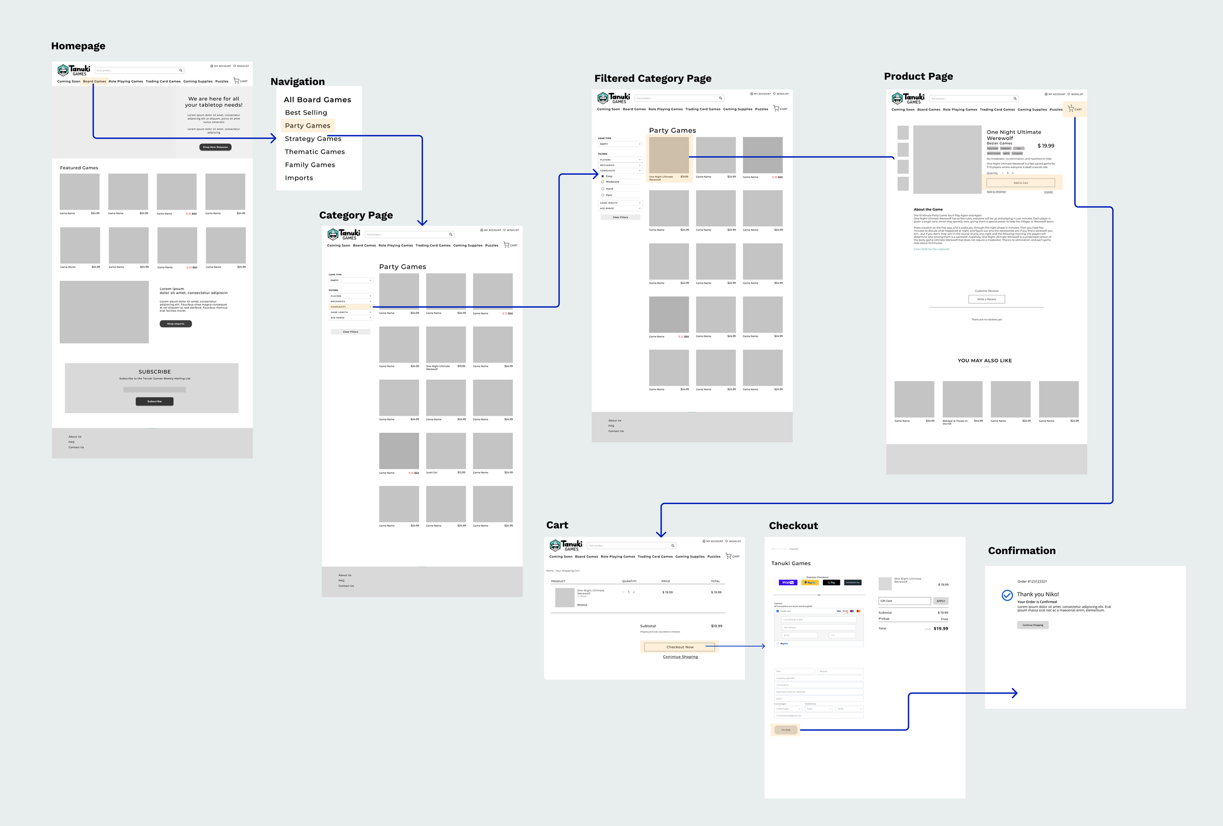
With a simple layout and a better filtering system, the redesigned e-commerce website allows users to easily discover and find the board games they want just as easily as the in-store shopping experience.
Note: This concept project was an educational exercise to practice UX skills and it is not affiliated with Tanuki Games.
There's a certain magic in going to a board game store.
Every board game represents the possibility of game nights shared with family and friends: memories, laughter, and victory. Tanuki Games is one of the best board game stores in Austin. TX. Boasting hundreds of board games, the store is beloved in the community. However, their online store is frustrating to navigate.
My role was to redesign Tanuki Games’ e-commerce site to be more user-focused to allow users to easily discover games and drive sales across their wide range of products.
WHAT IS THE PROBLEM SPACE?
One Does Not Simply…Buy a Game
I interviewed four board game enthusiasts in order to better understand their board game purchasing motivations and challenges. I also wanted to see how users would search for and buy products on the current website; two of the users interviewed often frequented the store and had never used their online website before.
What is the difference for users when buying games in-store vs. online?
What’s important for a great online purchasing experience?
What motivates users to buy one board game over another?
What considerations do users take when purchasing board games?
What are users’ opinions on the current website?
I wanted to understand how and why people buy board games these days...
...through interviews, I uncovered three main insights...
#1
Since most board games need at least two people to play, users scarcely buy games on pure interest alone. I have to factor in other criteria to make sure others will want to play too.
#2
Board games are an investment of time and money, so users will check reviews before a board game purchasing unless it’s cheaper or they’ve played the game previously.
#3
Users prefer to shop in person, as holding the game, the size and weight gives them a better sense of what they are purchasing.
...and observed users’ frustrations with the current website.
1. There is no way I’m scrolling through 33 pages
At first glance, Tanuki Games’ layout seems straightforward and relatively easy to navigate. However, when tasked with finding two products to purchase, users were frustrated with their ability to discover games with the website’s navigation categories and filtering options.
All 3 user’s only navigated a few pages deep before giving up on going any further.
2. I have no idea what this game would play like
Without being able to see or hold the game, users had to rely on product descriptions and pictures to gauge interest. However, product pages were vastly inconsistent, making it difficult for users to understand its components or gameplay without doing an additional online search.
2 out of 3 users choose cheaper games because they felt it would be less of a purchase risk.
3. Why do I have to create an account?!
Users did not like that there was no guest checkout option. They felt it was incredibly restricting and did not want to keep track of another password.
One user voiced their frustration by indicating that I might have been annoyed enough to buy it elsewhere, like amazon.
WHO AM I DESIGNING FOR
As in Real Life
Each individual user had a lot to say, but with synthesized research, I was able to create a single persona in order to hone in on the underlying wants and frustrations of a Tanuki Games customer. I then could map out a retrospective user journey of the persona to pinpoint areas of frustration and opportunity.
The research insights helped define our main persona– The Casual Enthusiasts
Ray loves board games at least once a month with their group of friends. They love to support their local board game shop when purchasing games but feel overwhelmed when using their online store.
Wants to buy board games that they can replay and enjoy multiple times
Wants confidently purchase a game that meets their expectations
Needs an easy way to discover new games that fit their specific criteria of play
“I’m always looking for a new game to play but I have to make sure others will want to play too”
It’s not me…its you, Tanuki Games
In order to understand how this persona feels when browsing Tanuki Game’s website, I took our persona, on a journey to highlight their emotional state. In this scenario, I highlighted two potential dropout points where the persona could get too frustrated with Tanuki Games’ current layout and leave the site altogether before checkout.
Our user journey revealed areas of opportunity to create a better organized and refined layout.
How might we improve the filter options and product descriptions so that User’s feel confident and informed to make a purchase online?
HOW WILL I DESIGN The SOLUTION?A Little Makeover
With our research and our persona, I was able to move into the design phase. I quickly began sketching my ideas on paper before settling on the final design solutions that I would then transfer into low-fi wireframes in Figma.
With our persona and opportunity defined, it was time to ideate what Tanuki’ Games’ new layout would look like.
Some considerations included:
Moved the global navigation bar to the top of the screen to accommodate filters later.
Filters allow users to narrow down results based on various criteria needed
The product page includes (clickable) tags to give an instant overview of each game.
With this in mind, I made a low-fidelity prototype based on my sketches

WhAT DIS USERS THINK OF MY DESIGN?Ready Usability Tester One…
I conducted a round of monitored usability tests on my wireframes with three users. Each user was tasked to find an “easy board game” to play with a large group of friends, add to their cart and then complete the checkout process.
THE GOOD
All 3 users were able to successfully find the products described in the task.
Users liked the layout and options to filter based on the number of players or complexity.
Users felt quickly informed about the basic content of the board game from the tags and brief descriptions.
THE OKAY
Two of the users wanted to filter by the number of players first, an option that was not yet available on my low-fi prototype. Both users’ next assumption was to search by complexity.
These two user misclicks were the only errors of the usability test.
The prototypeReady Usability Tester One…
With overall strong usability testing results and feedback, I felt confident moving into the next stage of the design process: high-fidelity wireframes.
One Board Game Website to Rule Them All
Tanuki Game’s new website allows users to easily navigate through board game categories, just like the physical store.
Learnings &
Reflections
My next steps are to iterate on the prototype and conduct another round of usability tests to make sure users have the best experience.
With more time, I would conduct a second set of user research to target another important persona that was missing from this project. While the users I interviewed were all self-proclaimed board game enthusiasts, I am missing the perspective of the niche set of avid board game players.
I love board games and I frequently purchase my board games at Tanuki Games. I chose this project because of my own frustrations with the store’s online store. However, while that made this project personal to me, it was important to keep my personal preference and assumptions at bay while redesigning the e-commerce experience.


